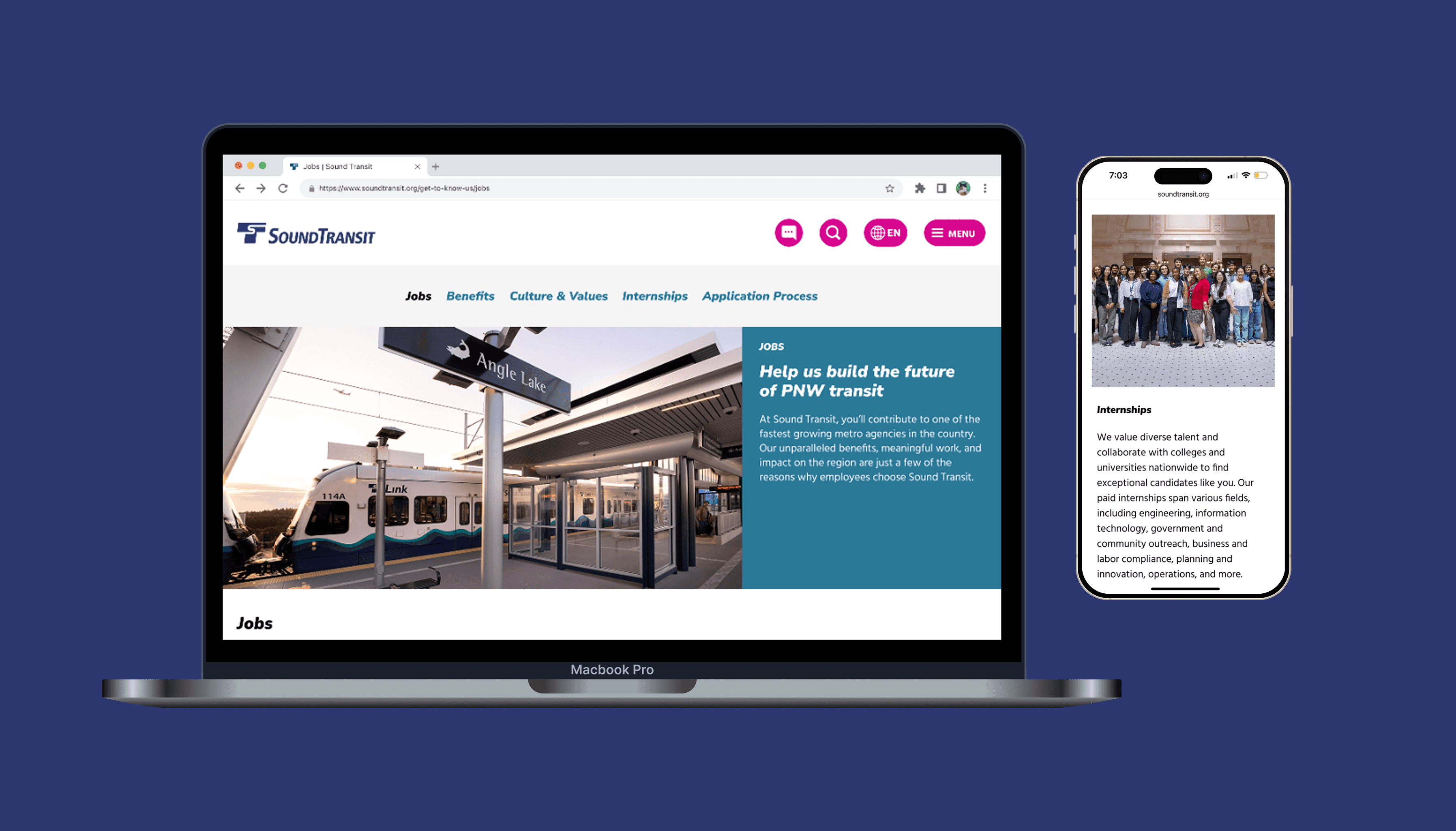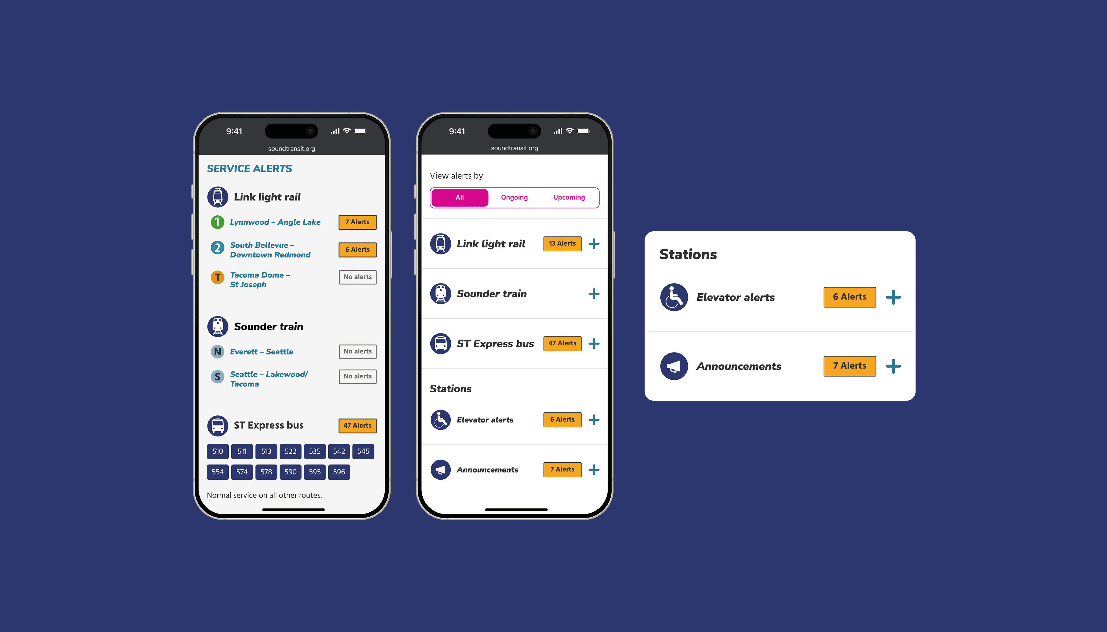
Reducing route and alert-related confusion for passengers riding on Sound Transit services.
As a Web Design Intern for the country's fastest growing transit agency, I evaluated and redesigned the agency's passenger alerts pages to better communicate route status and disruptions to riders. From initial peer analysis to final handoff, I ensured that the final prototype was responsive across multiple devices, compliant with WCAG guidelines, and consistent with Sound Transit's design system.
DURATION
Nov 2025 - Jan 2026
ROLE
Web Design Intern
TEAM
1 PM, 1 Researcher, 2 Designers
BACKGROUND
Passengers in the Seattle region go to soundtransit.org for up-to-date information on their most used routes (including buses, light rail, and commuter rail).
41M boardings in 2025
System will 2x in length by 2041
WHY REDESIGN IT?
Since the initial alerts module was shipped in 2023, 2 areas of the page were left unanswered, causing confusion amongst riders.

INITIAL HYPOTHESIS
Including all lines (including those without active alerts) and distinguishing non-elevator related station alerts will reduce passenger confusion on the home and alerts page.
PEER AGENCY ANALYSIS
I started by examining how other transit agencies use color, copy, and iconography in their alerts panel.
Working with another designer, we took a look at 8 national and international transit agencies to see how they display lines with alerts vs. no alerts.
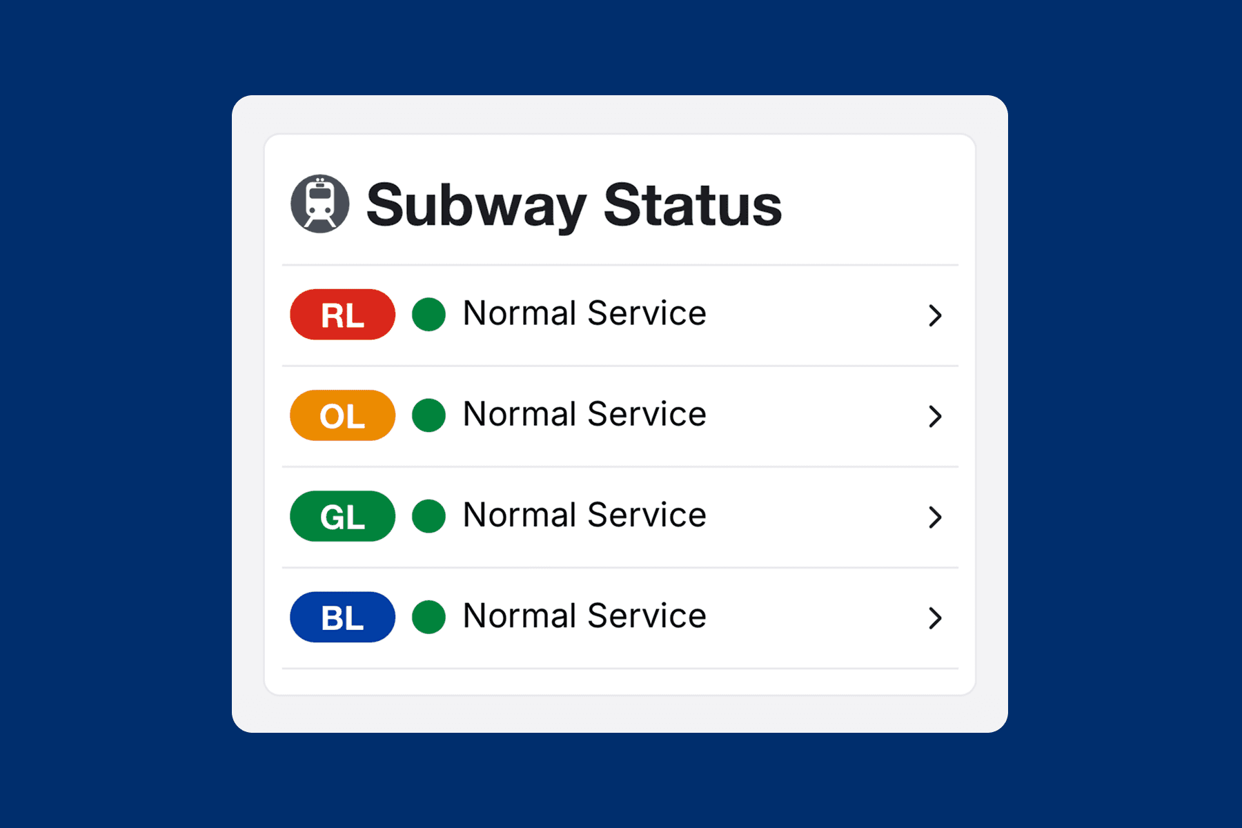
MBTA (Boston)
Green dot + Normal Service text
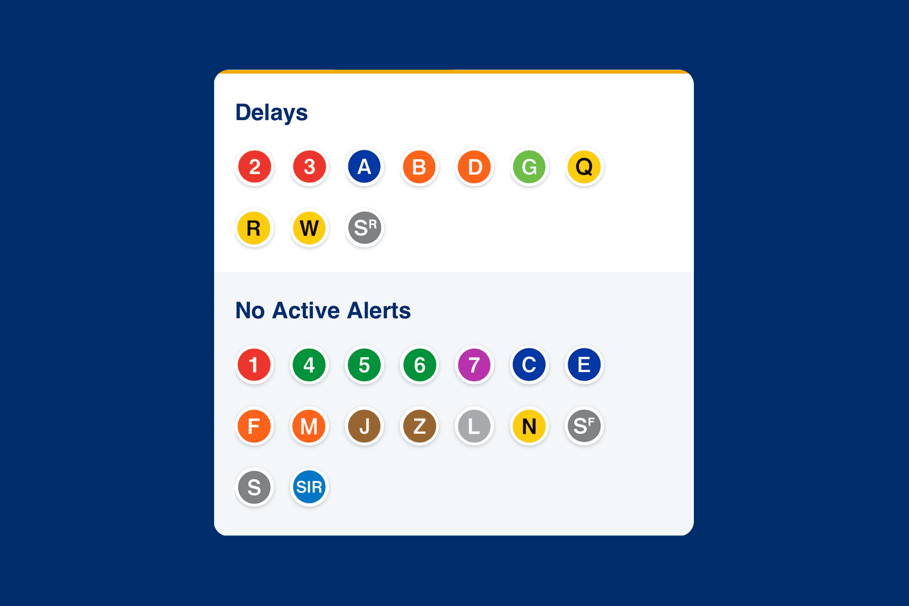
MTA (New York City)
Separate section titled "No Active Alerts"
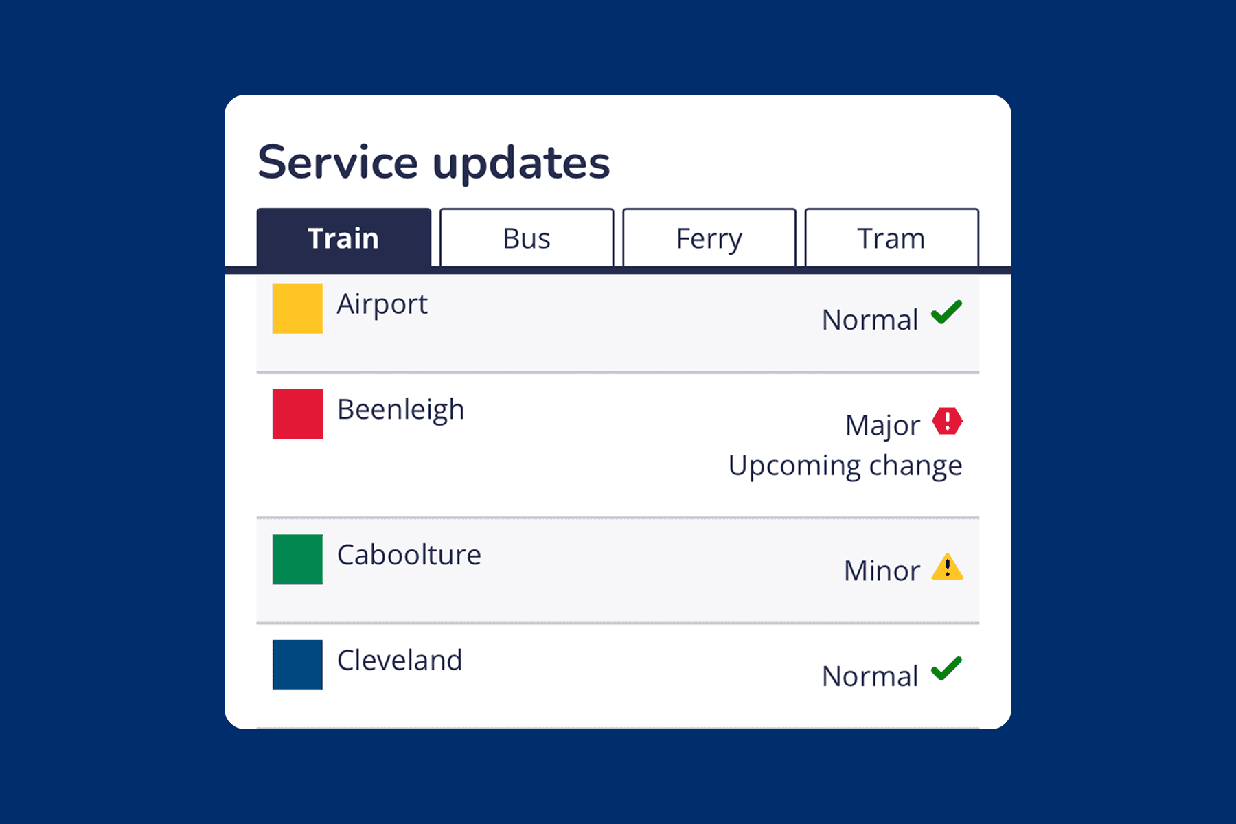
TransLink (Queensland)
Icon (checkmark / yellow triangle) + text
INITIAL EXPLORATIONS
Following peer agency analysis, I drafted initial explorations of how to display lines with no alerts on the homepage.
The inclusion of a "Normal Service" tag was commonly found throughout our peer agency analysis. I took inspiration from the agencies I reviewed, whilst also considering ST's design system, to come up with 5 initial drafts. Explorations included combinations of iconography (checkmark), color, and copy.

INTRODUCING CHANGES
After presenting initial versions of "Normal Service" tags to the digital team, and we landed on 2 preferred options, as well as a new way to visualize the Stations section.
"NORMAL" TAGS
STATIONS SECTION

USER TESTING
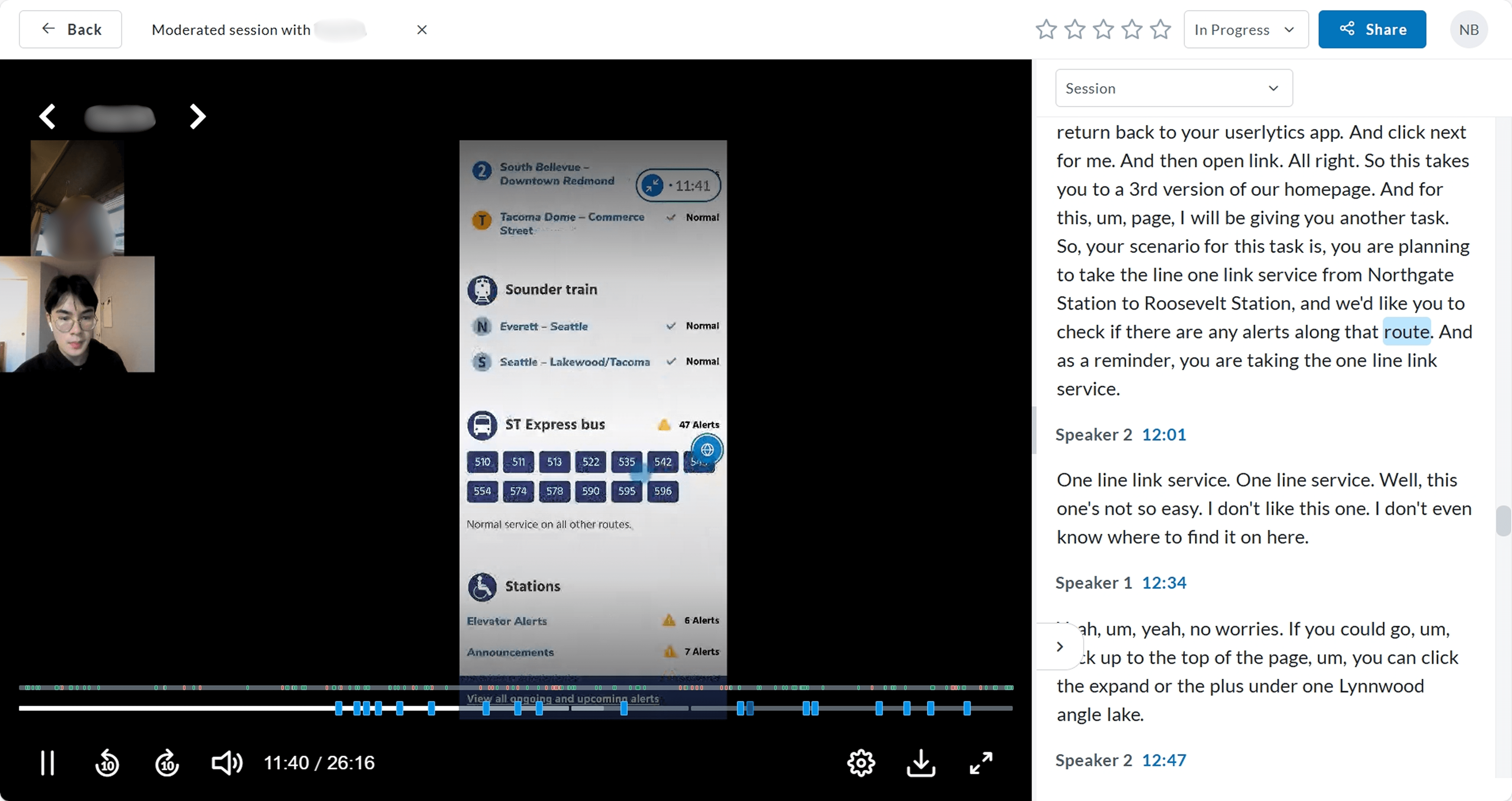
To gauge rider approval of these changes, we conducted moderated usability testing with 12 participants.
We recruited a mix of riders and nonriders outside of WA state, with varying degrees of familiarity with our system. Throughout planning, I worked closely with the UX Researcher to draft research questions and interview scripts to ensure a positive interviewee experience.
INSIGHTS
Passengers approved of the inclusion of normal service tags and non-elevator alert information. But how (and where) to display them was another challenge.
Insight 1: 8/12 supported adding routes with no alerts to the home page. However, opinions about which tag style best communicated normal service were split.

Insight 2: 10/12 preferred the redesigned Stations section, with reservations about iconography.

Insight 3: Users expected alert tags to be a clickable object, which would lead them to more detailed information about the route's alerts.

ITERATING
After learning that users expected to be able to click on alert tags, our approach to "Normal Service" tags changed.
We now needed to emphasize alert tags (displayed next to routes with alerts) as clickable, whilst "de-emphasizing" normal tags (displayed next to routes with no alerts) as non-clickable.
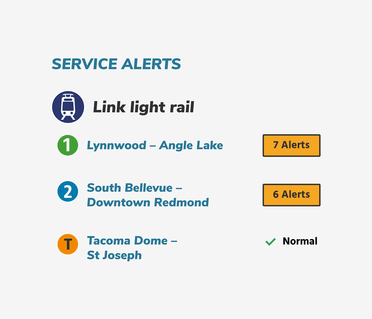
APPROACH 1
Combine the 2 alert tag styles.
✅ Visually differentiates lines with alerts vs lines with no alerts.
✅ Lack of border around Normal de-emphasizes it as a clickable object.
❌ Lacks visual cohesion.
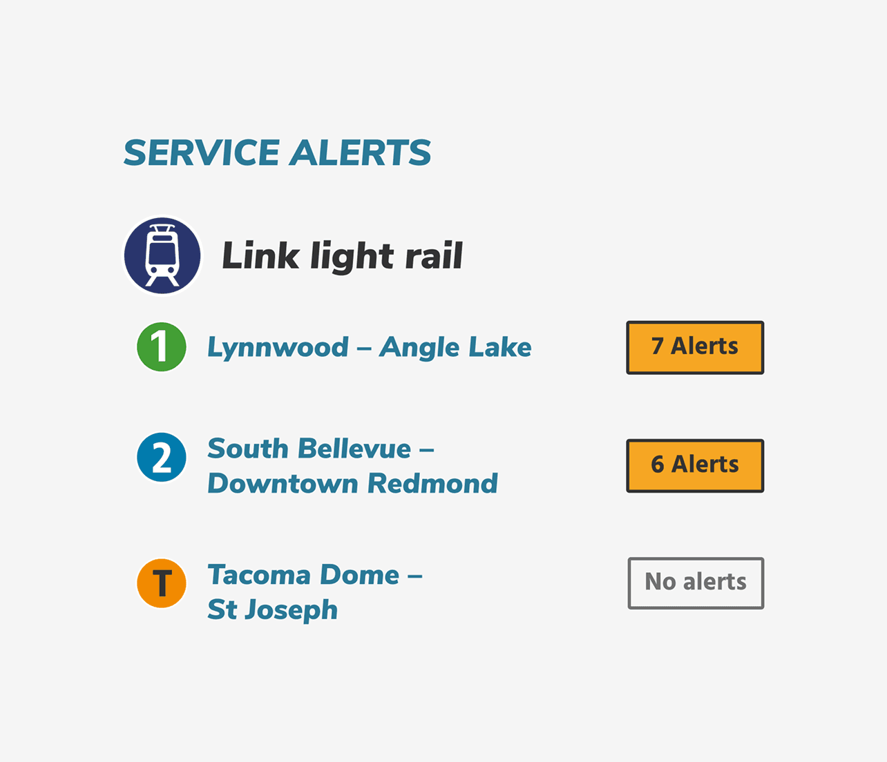
APPROACH 2 (CHOSEN)
Use a deactivated button for the "Normal" tag, and use "No alerts" instead of "Normal".
✅ Maintains visual consistency between the alert and normal tags.
✅ "Normal" carries ambiguity, while "No alerts" is more specific and clear
❌ Removes green checkmark, which users found helpful during testing.
FURTHER ITERATING
Finally, we met with the the Passenger Information Coordination (PIC) team to assess feasibility of the Stations section change.
The PIC team at Sound Transit is responsible for writing and communicating out alerts on the ST system. Through our conversations, we got their approval on separating the Stations section into 2 links (Elevator Alerts & Announcements), and clarified that non-conveyance alerts (that do not affect elevators or escalators) should go under the "Announcements" subsection.
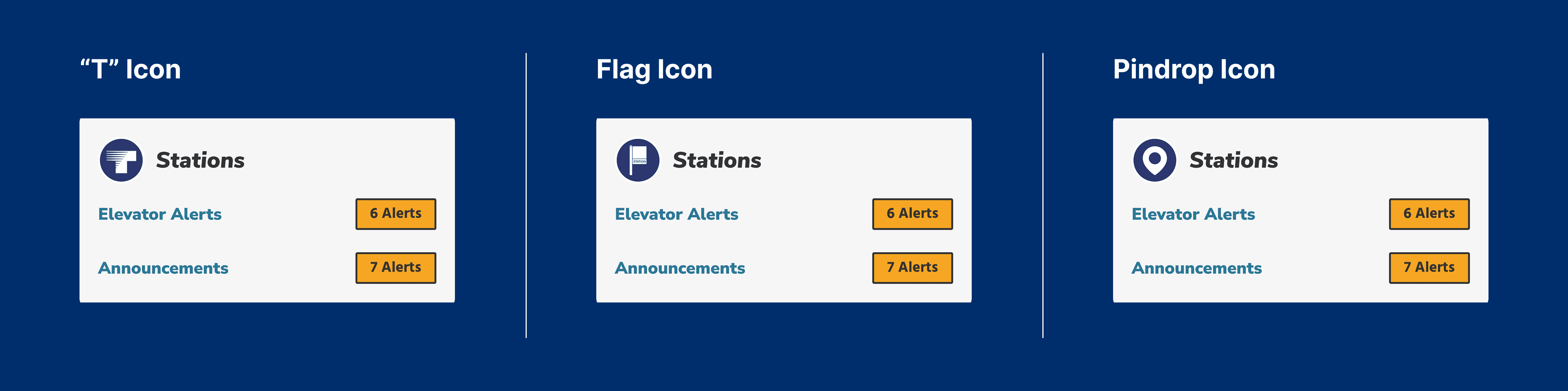
We also agreed upon the pindrop icon as a suitable icon replacement for the Stations section, as it's currently used on the TripPlanner (Sound Transit's beta mobile app).
FINAL STATE
The new home and service alerts page display all expected routes with route status clearly visualized, offering a single source of truth that reduces passenger confusion.
HOME PAGE

SERVICE ALERTS PAGE

A comprehensive view of the system.
On the more detailed Service Alerts page, passengers can still click to expand information about alerts, whilst being reassured that other lines are experiencing no disruptions.
HANDOFF
After weeks working on this project, I worked with the other design intern to finalize a handoff file to the digital team.
While this change seemed simple at first, there were many edge cases and breakpoints we had to consider. Our handoff file included:
Happy path interactions, empty states
Notes and annotations about updated components / icons
Component interactions and triggers
Mobile and desktop flows
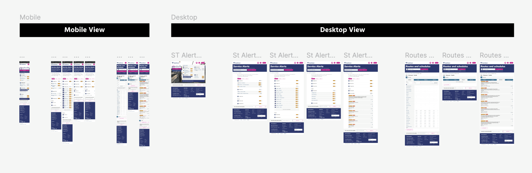
Handoff file
IMPACT
While the outcome of this project was to reduce rider confusion and anxiety, there are also some quantitative metrics I would've measured to approximate this impact:
Decrease in # of passenger-submitted tickets to the Digital Team
Increase in public trust ratings for ST's route status communication
Passenger Support staff reporting less inquiries about status of a line
REFLECTION
Learnings & Lessons
As a long-time passenger of Sound Transit's services, contributing to this project felt extra meaningful and exciting. Although our design exploration started off small, the scope of our redesign gradually grew, and I learned to bring up constraints and limitations that I hadn't previously considered. Pushing through these challenges made me a more thoughtful and system-minded designer.
🗑️ Be open to unexpected insights, and allow them change your design process and priorities
While our 2 explorations of the "Normal" tag didn't have a clear winner, testing them led us to the insight that users expect clickability from the alert tags. This wasn't the outcome that I had hoped, but it was a good reminder that usability testing isn't just about validation, but also about understanding parts of the experience that would've been otherwise overlooked.
🚉 Don't ignore physical infrastructure
Working on my laptop, it was easy to overlook how passenger alerts are actually communicated within stations. The PIC team helped us understand which existing icons are being phased out throughout the system, helping us choose our replacement icon for the Stations section.
YOU MIGHT ALSO LIKE…
Enhancing Sound Transit's appeal to jobseekers and attracting top talent to the agency.