


OPPORTUNITY FOR DESIGN
How might we surface hospital resources prominently, directly connecting patients and families with services they need but can't easily find?
LANDSCAPE ANALYSIS
Learning how other apps surface relevant resources.
After conducting a landscape analysis, our team learned that many apps surface resources during search, keep saved resources in immediately accessible locations, and create alternative breakpoints. These apps not only make finding resources easier, they actively promote them through various entry-points and channels.
Airbnb
Location based search suggestions help travelers make their first choice.

NYT
Saved articles are spotlighted at the top, encouraging readers to revisit.

GOV.UK
Highlighting popular links reduces the work a user must perform to find commonly used resources.
PRIMARY RESEARCH
Observing how current users find resources on the app.
Our team conducted 5 interviews & usability tests with members from the hospital's Family Advisory pool. Given the sensitive nature of medical information and HIPAA, our team used non-personal accounts and omitted personally-identifiable information in interview transcripts.
Usability Testing Tasks
At the Hospital Main Campus, find a suitable dining location and save it to favorites.
Find information for the following resources: cell phone chargers, interpreter services, and Ocean 8 parking.
Find the nearest elevator from the Forest 1 Entrance. Then, navigate to a family lounge on the 5th floor.
IDEATION
Aligning and prioritizing redesigns with the SCH team.
After presenting our findings to the SCH team, we held a collaborative workshop to discuss high-level redesigns our team brainstormed. After ranking by impact and effort, we landed on 3 priorities:
Resources: improve discoverability of hospital resources
Favorites: make the favorites feature more visible to the user
Search Bar: redesign the search bar to help users find more personalized resources

Feature prioritization matrix
FEATURE OWNERSHIP
I took ownership over improving favorites management and enhancing search functionality for users.
Additionally, I helped set my team up for success by copying over the Design System sent to us by the SCH Team, Auto-Layouting template screens, and creating reusable components that the other designer on my team could use to explore different design directions.
EXPLORATION #1
Spotlighting resources on high-traffic pages.
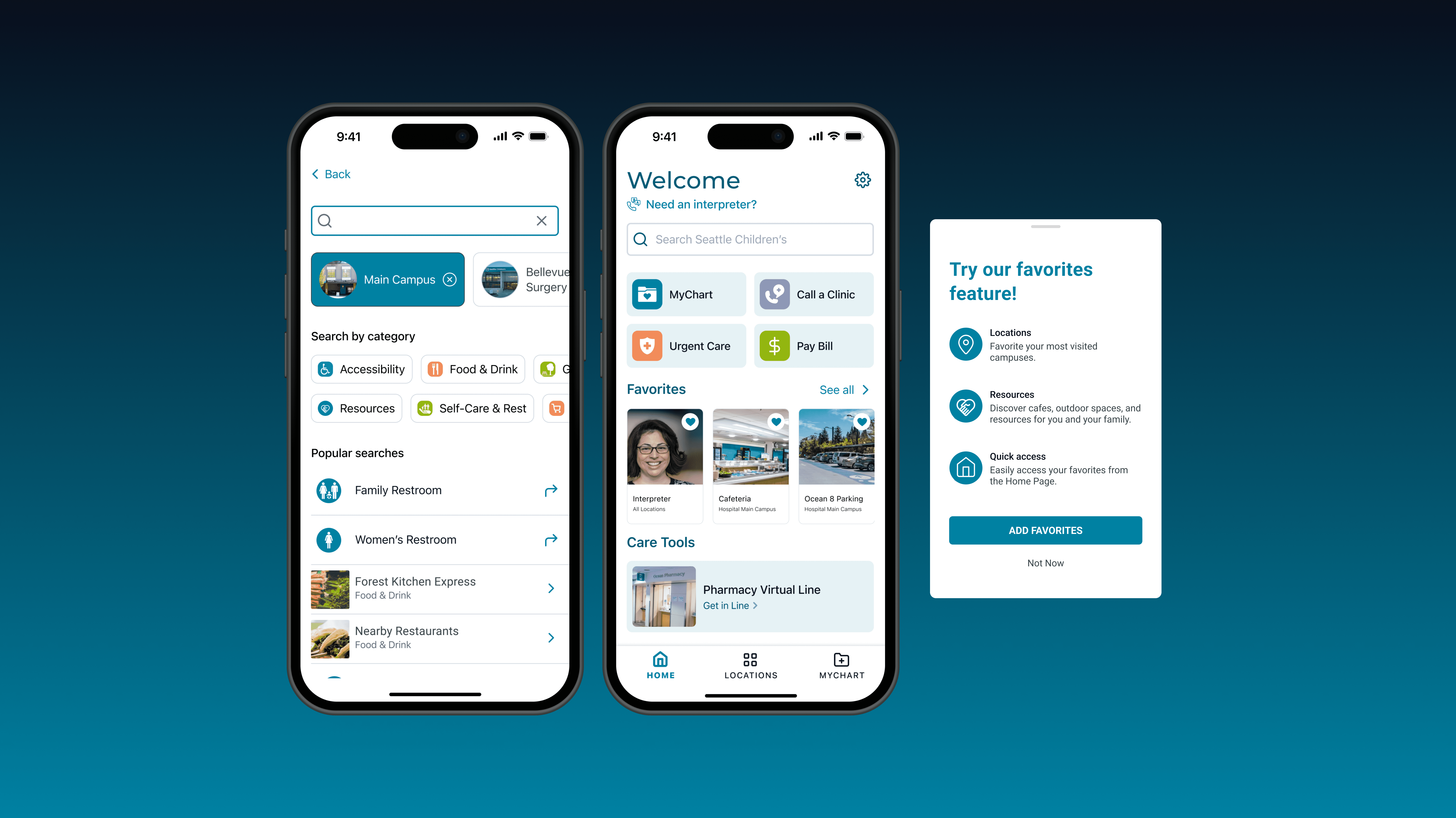
We learned from user interviews that not all users were aware of hospital resources or a favorites feature. I explored multiple ways of introducing the favorites feature to encourage users to discover and save resources.

The popup modal was chosen as the preferred vehicle for promoting favorites. The popup modal encourages exploration of resources, without taking up home page real estate.
EXPLORATION #2
Simplifying favorites management.
After users add their favorites, they need a centralized place to view and manage them. I explored how we could display favorited resources across various campuses seamlessly.

The tab bar option was chosen as it avoids overwhelming the user with information for multiple locations on one screen, whilst also minimizing scroll fatigue.
EXPLORATION #3
Introducing search filtering to surface more relevant results.
We learned from interviews that 4/5 users used the search bar to find resources instead of the actual resources tab. I wanted to introduce filtering to the search bar, so that users could quickly find the most relevant resources and amenities.

We chose Version 2 as the preferred method of filtering, as it allows for both location and popularity-based filtering to occur without the user having to make their filtering selections on another popup or page.
USABILITY TESTING
After further iterations, we tested our redesigns with 20 users on Maze.
Using an asynchronous platform like Maze allowed us to reach users outside of the family advisory pool and collect more accurate quantitative data about the efficacy of our redesigns.
WHAT WE LEARNED
Average 17% reduction in task difficulty ratings
For finding resources from search, task difficulty ratings dropped from 2.25 to 1.4, and accessing favorited resources dropped from 2.65 to 1.4.
Improved accessibility of hospital resources
Users noted that resources were "easier to find within the design" and a "much better than past experience".
📝 "The way each category was labeled and displayed made it easy to find what I was looking for."
📝 "Having symbols/pictures associated with each icon is helpful."
📝 "Good for favorites and “go-to” resources."
Resources page needs further iteration
While users appreciated search filtering and visibility of favorites on the home page, some still felt overwhelmed in finding the different resources on the Resources page.
📝 "Resources page listing everything felt a little overwhelming, even though there are tags."
📝 "If you don’t already know what you’re looking for, it can be hard to know where to start navigating."
ITERATING SOME MORE
Reorganizing the resources page to aid discovery.
Following our round of usability testing, our team made several changes to the Resources Page itself to help patients find relevant resources quicker.

FINAL DESIGNS
The new mobile experience encourages resource discovery through easier favorites management, location-based search, and favorites integration with maps.

Favorites
Saved resources are shown on the home page for quick access. High visibility encourages users to add more resources.

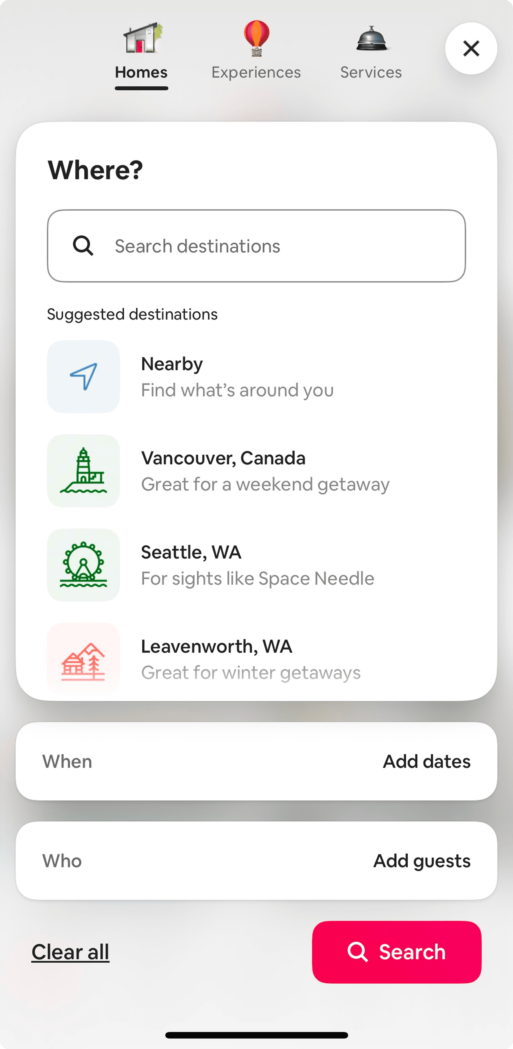
Location-based search
Progressive disclosure reveals information without overwhelming the user. Location filters increase relevancy of search results.

Favorites Integration with Maps
Saved resources are populated within map search, offering users a quicker path to getting to the right place.
FUTURE
Tracking future success ✅
While the proposed redesigns are a good start, further research will help assess how engagement with hospital resources improves over time.
Success Metrics
Percentage growth in users favoriting resources
Increased duration spent exploring hospital resources
Percentage of users who prefer exploring resources on home / search rather than locations tab
REFLECTION
Learnings & Lessons
I'm very proud of my team and the work we were able to accomplish! Along the way, I also carried some valuable lessons that I'll take with me into my next role.
🔍 The value of probing
During user interviews, I took a proactive role in asking clarifying questions to users. If a user struggled to find a resource and rated the task difficulty high, I'd ask questions like "where would you expect to find this resource?" Doing so helped our team better understand the user's expectations and identify where the current design didn't meet expectations.
⭐️ You design the team experience, too!
I went into this capstone with the mindset that no task was out of my reach. Supporting with non-design tasks (drafting recruitment email pitches, creating interview and survey questions, and writing research summary reports) gave me a new appreciation for the different strengths we bring to the table and how we all collectively advocate for the user.
✅ Aim to understand tradeoffs, not the perfect solution to move forward
In moments of decision paralysis, I focused on articulating tradeoffs of each solution and keeping our North Star (helping users discover hospital resources) in mind. This process made me a lot more confident in my recommendations to the team, and allowed me to gather feedback for more iterations!