Enhancing job seeker and candidate experiences on ST Jobs page.
DURATION
Jun 2025 - Aug 2025
ROLE
Web Design Intern
TEAM
1 PM, 1 Researcher, 1 Designer
ABOUT SOUND TRANSIT
Sound Transit is the regional transit agency serving Seattle and the surrounding Puget Sound Region. Employing over 1,700 people, the agency operates light rail, commuter rail, and bus routes across the area, seeing over 4 million monthly boardings.
WHY REDESIGN THE JOBS PAGE?
As Sound Transit undergoes one of the largest transit expansions in the country, the agency needs to attract and retain a committed, transit-passionate, and younger workforce.

Current site: Jobs, Benefits, Culture & Values, Employee Spotlight, Internships
KEY PROBLEMS
The public is unaware of the types of jobs Sound Transit offers. This information is buried under long paragraphs of text on the Jobs page.
1
The current Jobs site offers limited guidance about the application process and what candidates can expect from their interviews.
2
Content and visuals could use a refresh to better boost Sound Transit's appeal to job seekers.
3
COMPETITOR ANALYSIS
Evaluating career sites across various companies.
To gain inspiration for redesigns, I took note of visual style / imagery, information architecture, and copy under benefits, culture and values, and application FAQ sections.

Spotify
Lively use of color + short form videos

Expedia
Career Exploration cards

Nike
Seamless navigation through sticky bar
WEB ANALYTICS
Scraping quantitative data about the Jobs page.
Working with Sound Transit's Digital Specialist, I also obtained Google Analytics data to scope out which areas of the page could see the most impact from a potential redesign.

INSIGHTS
Desktop and mobile users are split 51/49, roughly even.
1
The click-through rate (those who eventually land on the Job openings page) is currently 80%, an impressive metric.
2
The most clicked on external link is rail and trade careers with King County Metro.
3
FIELD RESEARCH
Connecting with candidates at career fairs.
Additionally, I visited several community and university job fairs. My conversations with candidates naturally revealed the values that job seekers prioritize most when looking through workplaces.


SURVEYS
Insights from current Sound Transit employees.
What better way to understand candidate motivations for joining Sound Transit than from its current employees? I sent a survey out to 15 employees at Sound Transit, employing quantitative rating questions, ranking questions, and open-ended questions.

INSIGHTS
Why work at ST & Types of Jobs were ranked most important.
1
11/15 employees had used the soundtransit.org website to prepare for their application and/or interviews.
2
Long chunks of text made the page feel overwhelming, with more visuals / multimedia elements desired - "Some parts look very text heavy and hard to grasp the main points at a glance."
3
REDESIGN V1
Version 1 focused on breaking up heavy text with visual elements.
Key changes included:
Incorporating more color (such as ST's navy blue) and imagery to draw attention to different sections of the site
Condensing the table of contents into a sticky navigation bar, which takes up less space on desktop and mobile
Including an Application FAQ section to provide clarity to candidates about the interview process

USER VALIDATION
Version 1 was tested with 8 users in the WA state area.
Tests were conducted on Userlytics, combining free exploration of the prototype with more specific task-oriented activities.
INSIGHTS
The cards for job categories were helpful, but took up lengthy scroll space on mobile devices.
1
Users appreciated the sticky bar as an orienting element on the page.
2
The internships page felt generic and not tailored to young applicants.
3
USABILITY TESTING ITERATIONS
Rethinking the use of career cards to be more mobile-friendly.

The job category cards could be used more generally; instead of 13 cards, use 3 "catch all" cards for corporate jobs, apprenticeships, and driver / trades jobs.
USABILITY TESTING ITERATIONS
Making improvements to navigation and information architecture, whilst aligning with Digital Team capabilities.
While the previous navigation bar was preferred by testers as a convenient, all on one page solution, this would require extensive development efforts. As a compromise, I proposed using an existing component that still improves navigational experience without overloading developers.

Additionally, less relevant information (E-Verify and Employment Verification) were moved to the bottom of the page, leaving more room at the top for Jobs-related information.
USABILITY TESTING ITERATIONS
Separating job and internship related information, tailoring content to different audiences.

This decision was supported by the different audiences for interns and full time job seekers. This decision also allows the team to tailor Application FAQs, imagery, and benefits to a more specific audience.
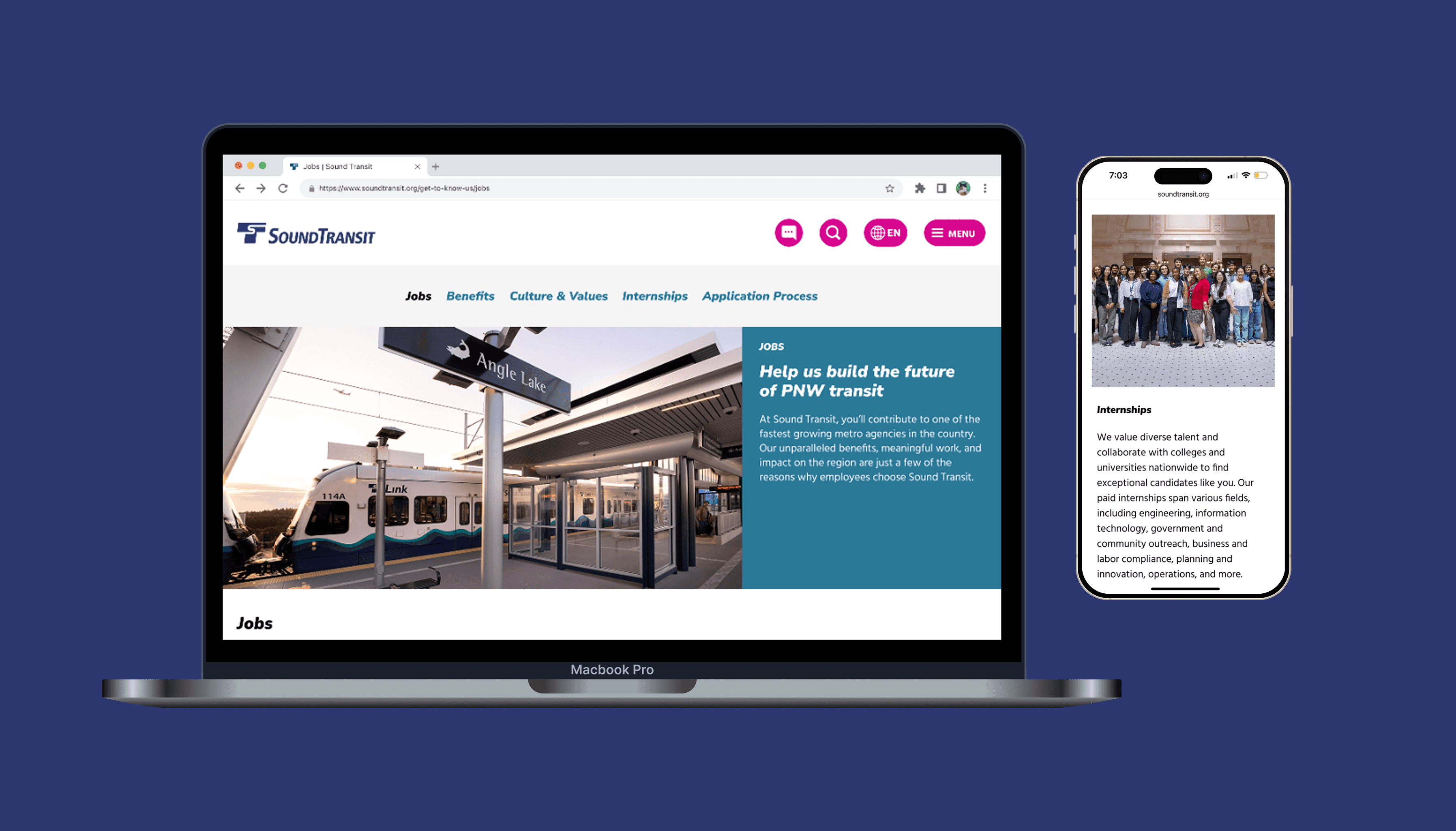
FINAL DESIGNS
The new jobs page offers improved navigation, engaging visuals and content, and increased transparency to candidates about the interview process.

The Internships page has been refreshed with new visuals and content for an early career audience.

Mobile-friendly access is supported by new navigation and collapsible accordions.
Jobs

Internships

REFLECTION
Things I would've done differently.
Although this redesign is already an improvement from the current site, there were a few things I would've explored given more time.
🎥 Consider short form video content
In order to appeal to a younger demographic, short form content and videos would be a great addition to the site, particularly for the Interns page.
🔍 Advocate with a systems lens
When pitching the sticky navigation bar, I could have built a stronger case by showing how the component could benefit other content-dense pages across soundtransit.org. A systemic argument would have been more persuasive to the development team.
YOU MIGHT ALSO LIKE…
Enhancing passenger communications and route status on ST's alerts page.